
Colour Pyschology - Motivate with Hues
- By Alex Wozny
- •
- 24 Apr, 2020

Color psychology is a discipline that researches how colour influences human behaviour and decision making. In this article we explore how colour impacts the way we perceive a brand and interact with promotional communications.
Technically speaking: Colour psychology is a theory that’s based how our brain processes colours. The human eye has a visual response to light. Colour wavelengths create electrical impulses that go to the hypothalamus in the brain, which influences many functions in the human body including behavioural and decision patterns, appetite, and body temperature among them.
It’s proven that the use of colours goes beyond a purely aesthetic impact. Colour psychology impacts your design and influences buying choices. Estimates show that 90 percent of an opinion about a product or service is based on colours alone, as colour is often the first thing people notice. Analytic research indicates that contrasting complementary colours increase conversion rates in digital ads and interaction rates on web pages, social channels, email communications and digital content.
The "101s" of Colour
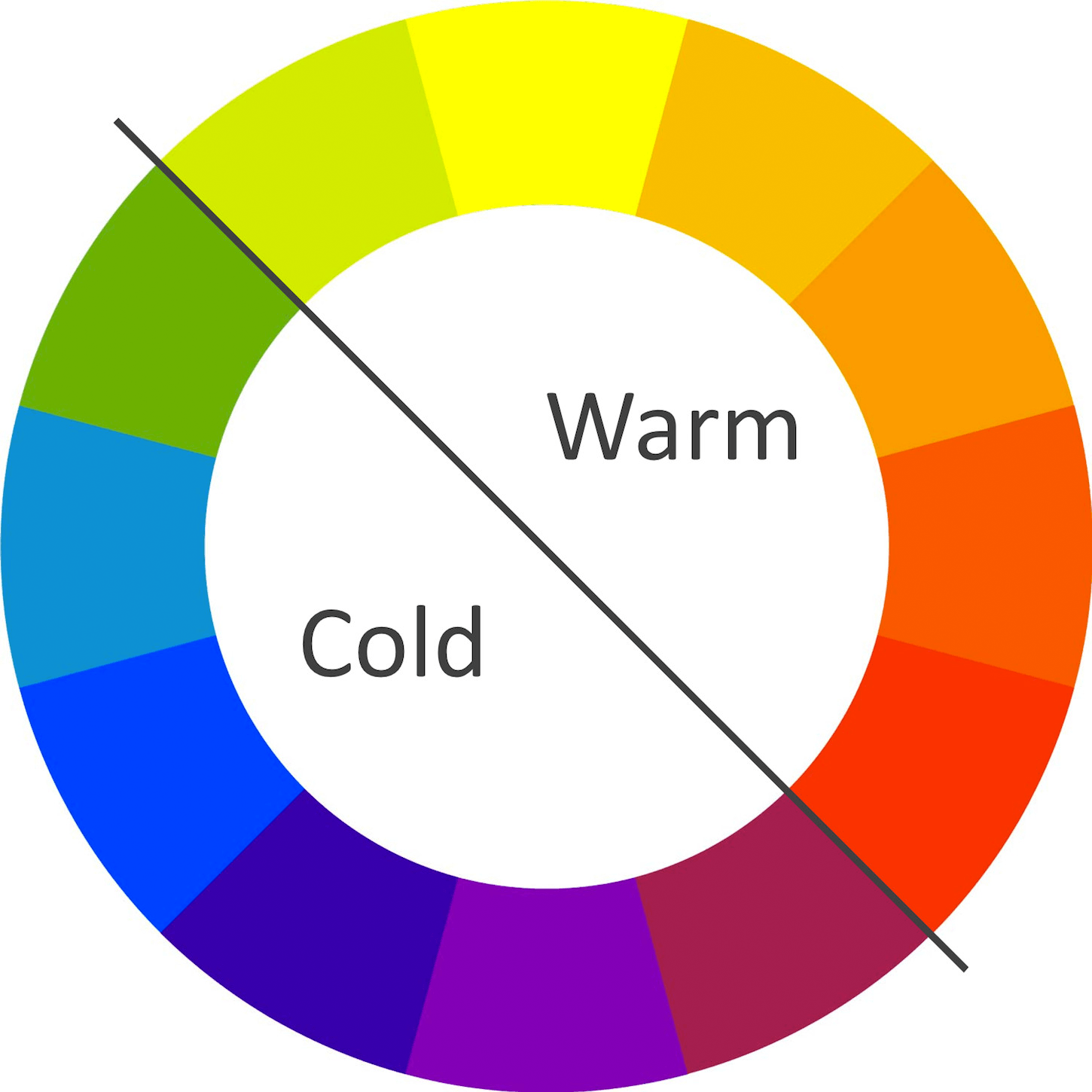
1. Stimulating or Calming - Warm and cold colours (Figure 1) have an impact on how we comprehend them. Warm colours work best when they are used as accent colours, vs using them as a basic colour. Too much of a warm colour is known to make designs look irritating and annoying. Cooler colours naturally create a calming effect but research says if they are overused they call to mind feelings of sadness.
2. Colour and Gender - There are both differences and similarities between men's and women’s perceptions of colour schemes. In depth details can be found in published research from Joe Hallock. Highlights include:
- there’s a clear preference in specific colours across gender and among the most noticeable is that both genders like blue and green
- men and women both shared least favourite colours: brown and orange
- the second favourite colour among women is purple
- purple is the least favourite colour among men
- when it comes to shades, tints, and hues, men generally prefer bold colours, while women prefer softer colours.
3. Culture Colour Preference - Colours can mean different things in different cultures. For example, in many Western cultures, white is associated with positive things, while in many parts of Asia, white is associated with mourning. As a result, it’s almost impossible to narrow one colour down to a solid meaning. One good resource to understand this further is the Colours and Materials website from WordPress.
Design with Colour
1. Complementary Colour Palette Choices - When selecting one colour ensure you understand colour complements. Color Hunt is a free and open platform for colour palette and complement inspiration. It helps you discover thousands of trendy hand-picked colour palettes and can provide insights for your next digital project.
2. Use Contrast for Conversion - The Button Colour A/B Test hypothesizes that contrast in digital content layout on pages impacts performance. The test data collected indicates that conversion and activation rates are improved with complementary contrasting colours. The best rule of thumb remains, make colour stand out and complement what is around it.
3. Colour Balance Rule - The 60-30-10-Rule (Figure 2) is one that many marketers and designers use to create well-balanced and visually interesting layouts. The 60-30-10 rule is a guide for creating balanced colour combinations that blend colour in harmonic proportions. This formula allows the eye to travel comfortably from one focal point to another.
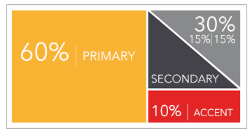
The idea is that one colour (usually, a neutral colour) makes up 60 percent of the palette - Dominant. Another complementary colour makes up 30 percent of the palette - Secondary. A third colour, which is used as an Accent, covers the remaining 10 percent. You can see many examples of this from a simple Google image search.
4. Brand Recognition through Colour - Using a colour palette to create a distinct style that is recognized is a proven technique for Brand recognition. (ex: Can you easily identify Coke soft drinks?) Some of the most successful Instagram accounts use a consistent brand colour palette for the photos they post. Colour associations for specific industries such as white for tech, green for eco products, and red for fast food are quite common.
A digitalroadmap® for Colour Selection
There are many approaches to consider when selecting a colour palette for your digital activities. Consider the issue of colour, harmony and relevance of different colour combinations of your digital assets with different themes, and how they sit with each other. This digitalroadmap® for Colour Selection assists with choosing hues that makes our content, website and advertising initiatives standout and get noticed. Hand-picked colour palettes and can provide insights for your next digital project.
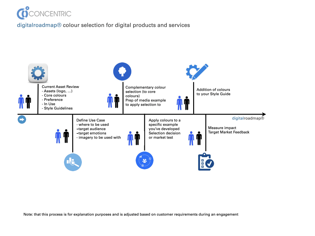
A good place to start with your Brand Colour Choices is with your business logo. As you go through your process, consider creating a ‘style guide’ and adding/incorporating your new colour selections to your style guide, website and digital properties, advertising and promotional material and your printed collateral.
Bottom Line: Having a coordinated brand statement in colour, pattern and design (Style Guide) is an important component of your business and influences how your target market perceives and interacts with you. Choosing the right colour palette that reflects the intent/purpose of your brand, can create a world of meaning for every business. Colour applications include branding, advertising, website and social page colour palettes, the imagery you choose to use on your digital products and posts … and virtually anything else related to your business communications. The colour selection process is rewarding, particularly when you can see the results “right before your eyes”.